Contents
- Matplotlib Tutorial - 파이썬으로 데이터 시각화하기
- Matplotlib 설치하기
- Matplotlib 기본 사용
- Matplotlib 숫자 입력하기
- Matplotlib 축 레이블 설정하기
- Matplotlib 범례 표시하기
- Matplotlib 축 범위 지정하기
- Matplotlib 선 종류 지정하기
- Matplotlib 마커 지정하기
- Matplotlib 색상 지정하기
- Matplotlib 그래프 영역 채우기
- Matplotlib 축 스케일 지정하기
- Matplotlib 여러 곡선 그리기
- Matplotlib 그리드 설정하기
- Matplotlib 눈금 표시하기
- Matplotlib 타이틀 설정하기
- Matplotlib 수평선/수직선 표시하기
- Matplotlib 막대 그래프 그리기
- Matplotlib 수평 막대 그래프 그리기
- Matplotlib 산점도 그리기
- Matplotlib 3차원 산점도 그리기
- Matplotlib 히스토그램 그리기
- Matplotlib 에러바 표시하기
- Matplotlib 파이 차트 그리기
- Matplotlib 히트맵 그리기
- Matplotlib 여러 개의 그래프 그리기
- Matplotlib 컬러맵 설정하기
- Matplotlib 텍스트 삽입하기
- Matplotlib 수학적 표현 사용하기
- Matplotlib 그래프 스타일 설정하기
- Matplotlib 이미지 저장하기
- Matplotlib 객체 지향 인터페이스 1
- Matplotlib 객체 지향 인터페이스 2
- Matplotlib 축 위치 조절하기
- Matplotlib 이중 Y축 표시하기
- Matplotlib 두 종류의 그래프 그리기
- Matplotlib 박스 플롯 그리기
- Matplotlib 바이올린 플롯 그리기
- Matplotlib 다양한 도형 삽입하기
- Matplotlib 다양한 패턴 채우기
- Matplotlib 애니메이션 사용하기 1
- Matplotlib 애니메이션 사용하기 2
- Matplotlib 3차원 Surface 표현하기
- Matplotlib 트리맵 그리기 (Squarify)
- Matplotlib Inset 그래프 삽입하기
Tutorials
- Python Tutorial
- NumPy Tutorial
- Matplotlib Tutorial
- PyQt5 Tutorial
- BeautifulSoup Tutorial
- xlrd/xlwt Tutorial
- Pillow Tutorial
- Googletrans Tutorial
- PyWin32 Tutorial
- PyAutoGUI Tutorial
- Pyperclip Tutorial
- TensorFlow Tutorial
- Tips and Examples
Matplotlib 축 스케일 지정하기

matplotlib.pyplot 모듈의 xscale(), yscale() 함수를 사용해서 그래프의 축 스케일을 다양하게 지정할 수 있습니다.
축은 기본적으로 ‘linear’ 스케일로 표시되지만 ‘log’, ‘symlog’, ‘logit’으로 변경할 수 있습니다.
Keyword: plt.xscale(), plt.yscale(), axis scale, linear, log
■ Table of Contents
1) X축 스케일 지정하기

예제
import matplotlib.pyplot as plt
import numpy as np

x = np.linspace(-10, 10, 100)
y = x ** 3

plt.plot(x, y)
plt.xscale('symlog')

plt.show()
xscale() 함수를 사용해서 X축의 스케일을 ‘symlog’로 지정했습니다.
‘symlog’는 Symmetrical Log Scale입니다.
축의 원점을 기준으로 양, 음의 방향이 대칭적인 로그 스케일로 표시됩니다.
결과는 아래와 같습니다.

Matplotlib 축 스케일 지정하기 - X축 스케일 지정하기
2) Y축 스케일 지정하기

예제
import matplotlib.pyplot as plt
import numpy as np

x = np.linspace(0, 5, 100)
y = np.exp(x)

plt.plot(x, y)
# plt.yscale('linear')
plt.yscale('log')

plt.show()
yscale() 함수를 사용해서 Y축의 스케일을 지정했습니다.
로그 스케일은 지수함수 (Exponential function)와 같이 기하급수적으로 변화하는 데이터를 표현하기에 적합합니다.
아래의 그래프는 Y축을 선형 스케일 (Linear scale)로 나타낸 결과이고,

Matplotlib 축 스케일 지정하기 - Y축 스케일 지정하기 (Linear scale)
아래의 그래프는 Y축을 로그 스케일 (Log scale)로 나타낸 결과입니다.
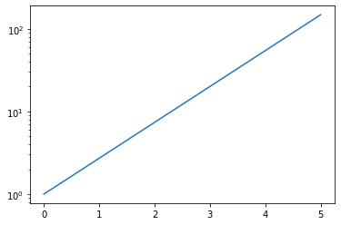
Matplotlib 축 스케일 지정하기 - Y축 스케일 지정하기 (Log scale)
이전글/다음글
이전글 : Matplotlib 그래프 영역 채우기
다음글 : Matplotlib 여러 곡선 그리기