Contents
- Matplotlib Tutorial - 파이썬으로 데이터 시각화하기
- Matplotlib 설치하기
- Matplotlib 기본 사용
- Matplotlib 숫자 입력하기
- Matplotlib 축 레이블 설정하기
- Matplotlib 범례 표시하기
- Matplotlib 축 범위 지정하기
- Matplotlib 선 종류 지정하기
- Matplotlib 마커 지정하기
- Matplotlib 색상 지정하기
- Matplotlib 그래프 영역 채우기
- Matplotlib 축 스케일 지정하기
- Matplotlib 여러 곡선 그리기
- Matplotlib 그리드 설정하기
- Matplotlib 눈금 표시하기
- Matplotlib 타이틀 설정하기
- Matplotlib 수평선/수직선 표시하기
- Matplotlib 막대 그래프 그리기
- Matplotlib 수평 막대 그래프 그리기
- Matplotlib 산점도 그리기
- Matplotlib 3차원 산점도 그리기
- Matplotlib 히스토그램 그리기
- Matplotlib 에러바 표시하기
- Matplotlib 파이 차트 그리기
- Matplotlib 히트맵 그리기
- Matplotlib 여러 개의 그래프 그리기
- Matplotlib 컬러맵 설정하기
- Matplotlib 텍스트 삽입하기
- Matplotlib 수학적 표현 사용하기
- Matplotlib 그래프 스타일 설정하기
- Matplotlib 이미지 저장하기
- Matplotlib 객체 지향 인터페이스 1
- Matplotlib 객체 지향 인터페이스 2
- Matplotlib 축 위치 조절하기
- Matplotlib 이중 Y축 표시하기
- Matplotlib 두 종류의 그래프 그리기
- Matplotlib 박스 플롯 그리기
- Matplotlib 바이올린 플롯 그리기
- Matplotlib 다양한 도형 삽입하기
- Matplotlib 다양한 패턴 채우기
- Matplotlib 애니메이션 사용하기 1
- Matplotlib 애니메이션 사용하기 2
- Matplotlib 3차원 Surface 표현하기
- Matplotlib 트리맵 그리기 (Squarify)
- Matplotlib Inset 그래프 삽입하기
Tutorials
- Python Tutorial
- NumPy Tutorial
- Matplotlib Tutorial
- PyQt5 Tutorial
- BeautifulSoup Tutorial
- xlrd/xlwt Tutorial
- Pillow Tutorial
- Googletrans Tutorial
- PyWin32 Tutorial
- PyAutoGUI Tutorial
- Pyperclip Tutorial
- TensorFlow Tutorial
- Tips and Examples
Matplotlib 이중 Y축 표시하기
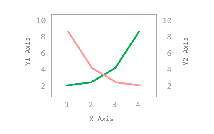
두 종류의 데이터를 동시에 하나의 그래프에 표시하기 위해 이중 축을 표시할 수 있습니다.
이 페이지에서는 Matplotlib 그래프에 두 개의 축을 동시에 표시하는 방법에 대해 소개합니다.
Keyword: Matplotlib.axes.Axes.twinx(), double y-axis, 이중 Y축, get_label()
■ Table of Contents
1) 기본 사용
예제
import matplotlib.pyplot as plt
import numpy as np
plt.style.use('default')
plt.rcParams['figure.figsize'] = (4, 3)
plt.rcParams['font.size'] = 12
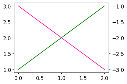
x = np.arange(0, 3)
y1 = x + 1
y2 = -x - 1
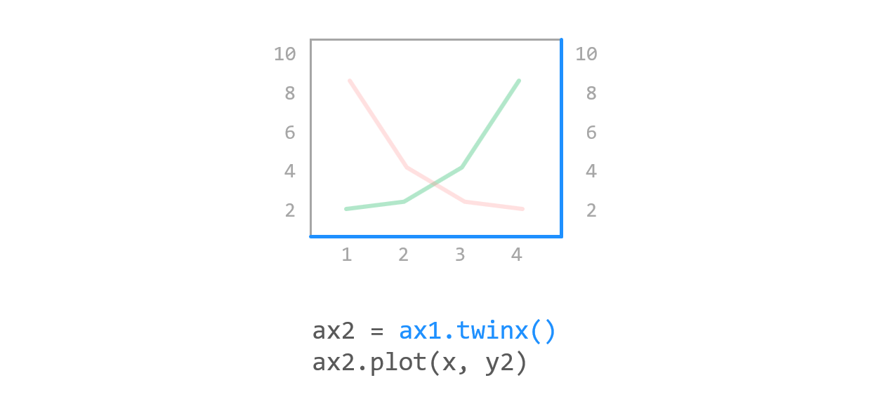
fig, ax1 = plt.subplots()
ax1.plot(x, y1, color='green')
ax2 = ax1.twinx()
ax2.plot(x, y2, color='deeppink')
plt.show()
ax1.plot(x, y1, color=’green’)은 첫번째 축에 (x, y1) 데이터를 나타냅니다.
ax1.twinx()는 ax1과 x축을 공유하는 새로운 Axes 객체를 만듭니다.
ax2.plot(x, y2)는 새로운 Axes 객체에 (x, y2) 데이터를 나타냅니다.
결과는 아래와 같습니다.
Matplotlib 이중 Y축 표시하기 - 기본 사용
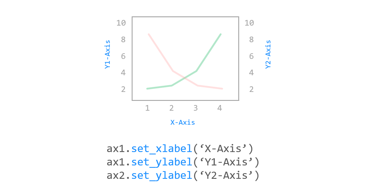
2) 축 레이블 표시하기
예제
import matplotlib.pyplot as plt
import numpy as np

plt.style.use('default')
plt.rcParams['figure.figsize'] = (4, 3)
plt.rcParams['font.size'] = 12

x = np.arange(0, 3)
y1 = x + 1
y2 = -x - 1

fig, ax1 = plt.subplots()
ax1.set_xlabel('X-Axis')
ax1.set_ylabel('1st Y-Axis')
ax1.plot(x, y1, color='green')

ax2 = ax1.twinx()
ax2.set_ylabel('2nd Y-Axis')
ax2.plot(x, y2, color='deeppink')

plt.show()
set_xlabel(), set_ylabel() 메서드는 각 축에 대한 레이블을 표시하도록 합니다.
(Matplotlib 축 레이블 설정하기 페이지를 참고하세요.)
결과는 아래와 같습니다.
Matplotlib 이중 Y축 표시하기 - 축 레이블 표시하기
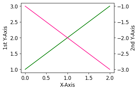
3) 범례 표시하기 1
예제
import matplotlib.pyplot as plt
import numpy as np

plt.style.use('default')
plt.rcParams['figure.figsize'] = (4, 3)
plt.rcParams['font.size'] = 14

x = np.arange(0, 3)
y1 = x + 1
y2 = -x - 1

fig, ax1 = plt.subplots()
ax1.set_xlabel('X-Axis')
ax1.set_ylabel('1st Y-Axis')
ax1.plot(x, y1, color='green', label='1st Data')
ax1.legend(loc='upper right')

ax2 = ax1.twinx()
ax2.set_ylabel('2nd Y-Axis')
ax2.plot(x, y2, color='deeppink', label='2nd Data')
ax2.legend(loc='lower right')

plt.show()
각 축의 데이터 곡선에 대한 범례를 나타내기 위해 legend() 메서드를 사용합니다.
(Matplotlib 범례 표시하기 페이지를 참고하세요.)
결과는 아래와 같습니다.
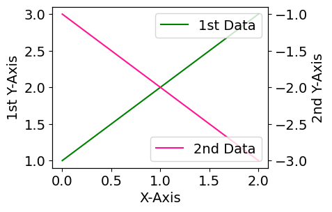
Matplotlib 이중 Y축 표시하기 - 범례 표시하기 1
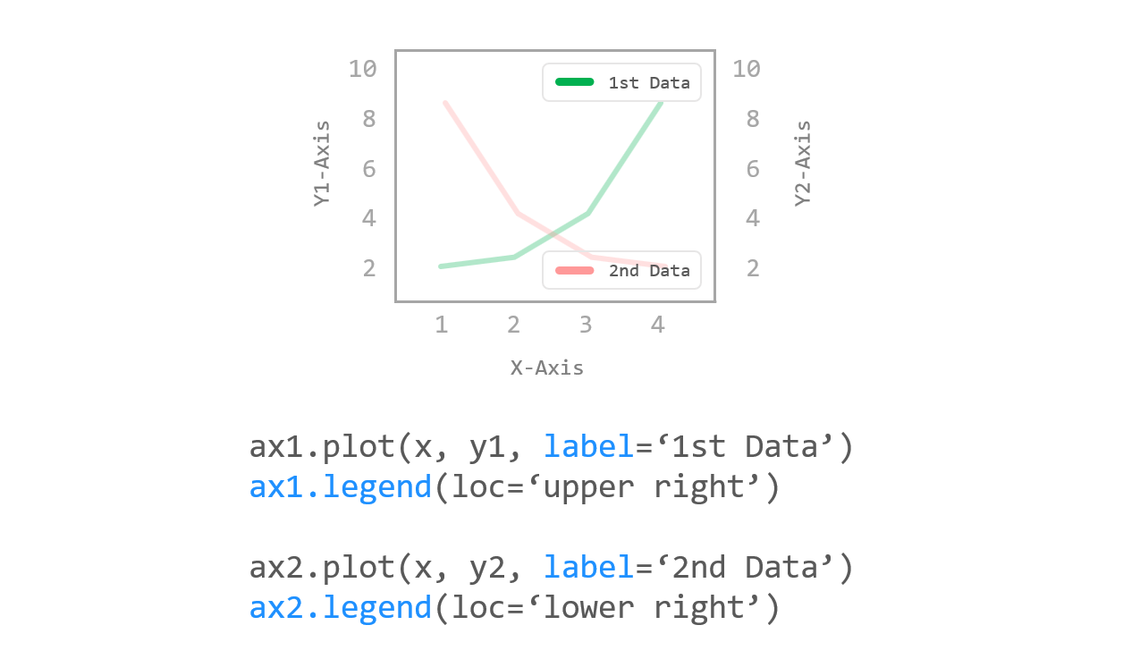
4) 범례 표시하기 2
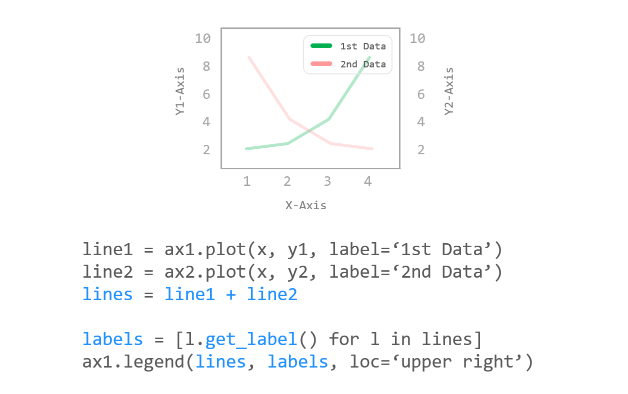
예제
import matplotlib.pyplot as plt
import numpy as np

plt.style.use('default')
plt.rcParams['figure.figsize'] = (4, 3)
plt.rcParams['font.size'] = 14

x = np.arange(0, 3)
y1 = x + 1
y2 = -x - 1

fig, ax1 = plt.subplots()
ax1.set_xlabel('X-Axis')
ax1.set_ylabel('1st Y-Axis')
line1 = ax1.plot(x, y1, color='green', label='1st Data')

ax2 = ax1.twinx()
ax2.set_ylabel('2nd Y-Axis')
line2 = ax2.plot(x, y2, color='deeppink', label='2nd Data')

lines = line1 + line2
labels = [l.get_label() for l in lines]
ax1.legend(lines, labels, loc='upper right')
plt.show()
두 축에 대한 범례를 하나의 텍스트 상자에 표시하기 위해서는 위의 예제와 같이
두 곡선을 먼저 합친 후 legend() 메서드를 사용하세요.
결과는 아래와 같습니다.
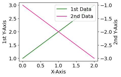
Matplotlib 이중 Y축 표시하기 - 범례 표시하기 2