Contents
- Matplotlib Tutorial - 파이썬으로 데이터 시각화하기
- Matplotlib 설치하기
- Matplotlib 기본 사용
- Matplotlib 숫자 입력하기
- Matplotlib 축 레이블 설정하기
- Matplotlib 범례 표시하기
- Matplotlib 축 범위 지정하기
- Matplotlib 선 종류 지정하기
- Matplotlib 마커 지정하기
- Matplotlib 색상 지정하기
- Matplotlib 그래프 영역 채우기
- Matplotlib 축 스케일 지정하기
- Matplotlib 여러 곡선 그리기
- Matplotlib 그리드 설정하기
- Matplotlib 눈금 표시하기
- Matplotlib 타이틀 설정하기
- Matplotlib 수평선/수직선 표시하기
- Matplotlib 막대 그래프 그리기
- Matplotlib 수평 막대 그래프 그리기
- Matplotlib 산점도 그리기
- Matplotlib 3차원 산점도 그리기
- Matplotlib 히스토그램 그리기
- Matplotlib 에러바 표시하기
- Matplotlib 파이 차트 그리기
- Matplotlib 히트맵 그리기
- Matplotlib 여러 개의 그래프 그리기
- Matplotlib 컬러맵 설정하기
- Matplotlib 텍스트 삽입하기
- Matplotlib 수학적 표현 사용하기
- Matplotlib 그래프 스타일 설정하기
- Matplotlib 이미지 저장하기
- Matplotlib 객체 지향 인터페이스 1
- Matplotlib 객체 지향 인터페이스 2
- Matplotlib 축 위치 조절하기
- Matplotlib 이중 Y축 표시하기
- Matplotlib 두 종류의 그래프 그리기
- Matplotlib 박스 플롯 그리기
- Matplotlib 바이올린 플롯 그리기
- Matplotlib 다양한 도형 삽입하기
- Matplotlib 다양한 패턴 채우기
- Matplotlib 애니메이션 사용하기 1
- Matplotlib 애니메이션 사용하기 2
- Matplotlib 3차원 Surface 표현하기
- Matplotlib 트리맵 그리기 (Squarify)
- Matplotlib Inset 그래프 삽입하기
Tutorials
- Python Tutorial
- NumPy Tutorial
- Matplotlib Tutorial
- PyQt5 Tutorial
- BeautifulSoup Tutorial
- xlrd/xlwt Tutorial
- Pillow Tutorial
- Googletrans Tutorial
- PyWin32 Tutorial
- PyAutoGUI Tutorial
- Pyperclip Tutorial
- TensorFlow Tutorial
- Tips and Examples
Matplotlib 트리맵 그리기 (Squarify)
트리맵 (Treemap)은 계층적 데이터를 직사각형의 형태로 표현하는 방법입니다.
이 페이지에서는 Matplotlib과 Squarify 라이브러리를 함께 사용해서 기본적인 트리맵을 그리는 방법을 소개합니다.
■ Table of Contents
2) 기본 사용
예제1
import matplotlib.pyplot as plt
import squarify
plt.style.use('default')
plt.rcParams['figure.figsize'] = (4, 4)
plt.rcParams['font.size'] = 12
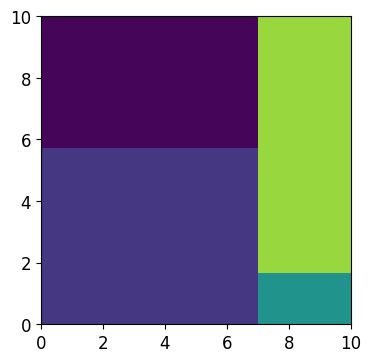
sizes = [40, 30, 5, 25]
squarify.plot(sizes)
plt.show()
squarify.plot(sizes)와 같이 리스트의 형태로 값을 입력하면 값을 비율에 맞는 넓이를 갖는 사각형 영역으로 표시합니다.
아래와 같은 트리맵이 나타납니다.
Matplotlib 트리맵 그리기 (Squarify) - 기본 사용
예제2
import matplotlib.pyplot as plt
import squarify
plt.style.use('default')
plt.rcParams['figure.figsize'] = (4, 4)
plt.rcParams['font.size'] = 12
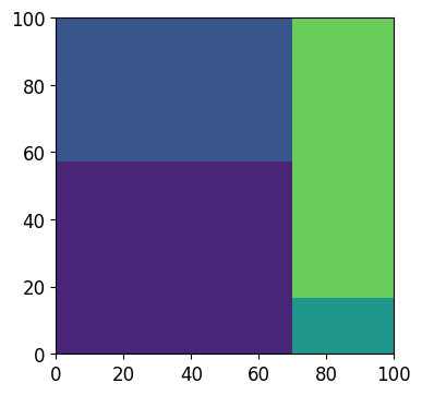
sizes = [40, 30, 5, 25]
squarify.plot(sizes, 10, 10)
plt.show()
squarify.plot(sizes, dx, dy)와 같이 dx, dy를 함께 입력하면 사각형 넓이의 총합이 dx * dy가 됩니다.
아래와 같은 트리맵이 나타납니다.
Matplotlib 트리맵 그리기 (Squarify) - 기본 사용2
3) 레이블 표시하기
예제
import matplotlib.pyplot as plt
import squarify
plt.style.use('default')
plt.rcParams['figure.figsize'] = (4, 4)
plt.rcParams['font.size'] = 12
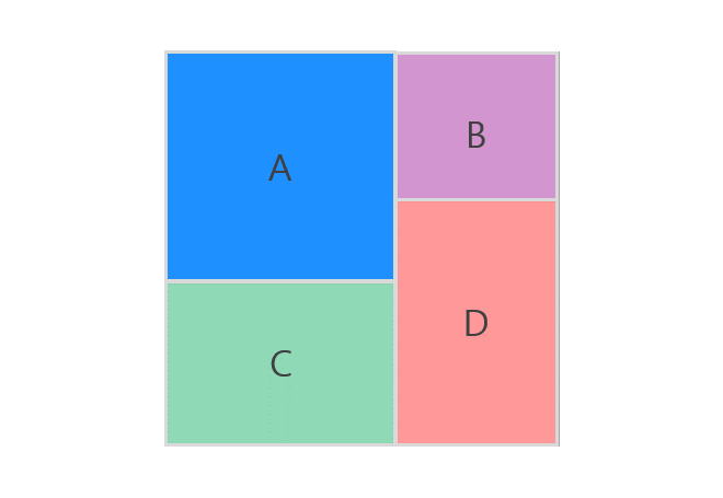
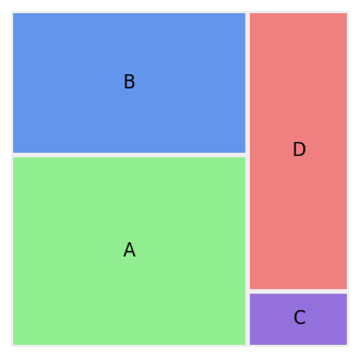
sizes = [40, 30, 5, 25]
labels= ['A', 'B', 'C', 'D']
squarify.plot(sizes, 10, 10, label=labels)
plt.show()
squarify.plot(sizes)의 label 파라미터에 문자열의 리스트를 입력하면 각 사각형 안에 레이블이 표시됩니다.
아래와 같은 트리맵이 나타납니다.
Matplotlib 트리맵 그리기 (Squarify) - 레이블 표시하기
4) 색상 지정하기
예제
import matplotlib.pyplot as plt
import squarify
plt.style.use('default')
plt.rcParams['figure.figsize'] = (4, 4)
plt.rcParams['font.size'] = 12
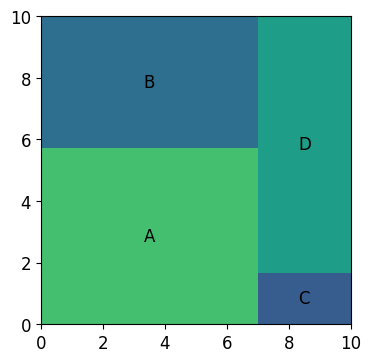
sizes = [40, 30, 5, 25]
labels= ['A', 'B', 'C', 'D']
colors = ['lightgreen', 'cornflowerblue', 'mediumpurple', 'lightcoral']
squarify.plot(sizes, 10, 10, label=labels, color=colors)
plt.show()
squarify.plot(sizes)의 color 파라미터는 사각형 영역의 색상을 지정합니다.
Matplotlib의 다양한 색상에 대해서는 Matplotlib 색상 지정하기 페이지를 참고하세요.
아래와 같은 트리맵이 나타납니다.

Matplotlib 트리맵 그리기 (Squarify) - 색상 지정하기
5) 축 제거하기
예제
import matplotlib.pyplot as plt
import squarify

plt.style.use('default')
plt.rcParams['figure.figsize'] = (4, 4)
plt.rcParams['font.size'] = 12

sizes = [40, 30, 5, 25]
labels = ['A', 'B', 'C', 'D']
colors = ['lightgreen', 'cornflowerblue', 'mediumpurple', 'lightcoral']

squarify.plot(sizes, label=labels, color=colors)
plt.axis('off')
plt.show()
plt.axis(‘off’)는 축이 표시되지 않도록 합니다.
아래와 같은 트리맵이 나타납니다.

Matplotlib 트리맵 그리기 (Squarify) - 축 제거하기
6) 테두리 두께 지정하기
예제
import matplotlib.pyplot as plt
import squarify

plt.style.use('default')
plt.rcParams['figure.figsize'] = (4, 4)
plt.rcParams['font.size'] = 12

sizes = [40, 30, 5, 25]
labels = ['A', 'B', 'C', 'D']
colors = ['lightgreen', 'cornflowerblue', 'mediumpurple', 'lightcoral']

squarify.plot(sizes, label=labels, color=colors,
              bar_kwargs=dict(linewidth=3, edgecolor="#eee"))
plt.axis('off')
plt.show()
bar_kwargs는 도형의 다양한 속성을 지정하도록 합니다.
linewidth와 edgecolor를 사용해서 사각형의 테두리 두께와 색상을 각각 지정했습니다.
아래와 같은 트리맵이 나타납니다.
Matplotlib 트리맵 그리기 (Squarify) - 테두리 두께 지정하기
7) NumPy 활용하기
예제
import matplotlib.pyplot as plt
import numpy as np
import squarify
np.random.seed(0)
plt.style.use('default')
plt.rcParams['figure.figsize'] = (4, 4)
plt.rcParams['font.size'] = 12
# sizes = [40, 30, 5, 25]
# sizes = [i**2 for i in range(1, 100)]
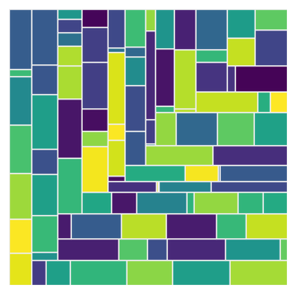
sizes = np.random.randint(1, 100, size=100)
squarify.plot(sizes, bar_kwargs=dict(linewidth=1, edgecolor="#eee"))
plt.axis('off')
plt.show()
NumPy를 사용해서 편리하게 숫자 데이터를 만들고 트리맵으로 시각화 할 수 있습니다.
아래와 같은 트리맵이 나타납니다.
Matplotlib 트리맵 그리기 (Squarify) - NumPy 활용하기