Contents
- TensorFlow - 구글 머신러닝 플랫폼
- 1. 텐서 기초 살펴보기
- 2. 간단한 신경망 만들기
- 3. 손실 함수 살펴보기
- 4. 옵티마이저 사용하기
- 5. AND 로직 연산 학습하기
- 6. 뉴런층의 속성 확인하기
- 7. 뉴런층의 출력 확인하기
- 8. MNIST 손글씨 이미지 분류하기
- 9. Fashion MNIST 이미지 분류하기
- 10. 합성곱 신경망 사용하기
- 11. 말과 사람 이미지 분류하기
- 12. 고양이와 개 이미지 분류하기
- 13. 이미지 어그멘테이션의 효과
- 14. 전이 학습 활용하기
- 15. 다중 클래스 분류 문제
- 16. 시냅스 가중치 얻기
- 17. 시냅스 가중치 적용하기
- 18. 모델 시각화하기
- 19. 훈련 과정 시각화하기
- 20. 모델 저장하고 복원하기
- 21. 시계열 데이터 예측하기
- 22. 자연어 처리하기 1
- 23. 자연어 처리하기 2
- 24. 자연어 처리하기 3
- 25. Reference
- tf.cast
- tf.constant
- tf.keras.activations.exponential
- tf.keras.activations.linear
- tf.keras.activations.relu
- tf.keras.activations.sigmoid
- tf.keras.activations.softmax
- tf.keras.activations.tanh
- tf.keras.datasets
- tf.keras.layers.Conv2D
- tf.keras.layers.Dense
- tf.keras.layers.Flatten
- tf.keras.layers.GlobalAveragePooling2D
- tf.keras.layers.InputLayer
- tf.keras.layers.ZeroPadding2D
- tf.keras.metrics.Accuracy
- tf.keras.metrics.BinaryAccuracy
- tf.keras.Sequential
- tf.linspace
- tf.ones
- tf.random.normal
- tf.range
- tf.rank
- tf.TensorShape
- tf.zeros
Tutorials
- Python Tutorial
- NumPy Tutorial
- Matplotlib Tutorial
- PyQt5 Tutorial
- BeautifulSoup Tutorial
- xlrd/xlwt Tutorial
- Pillow Tutorial
- Googletrans Tutorial
- PyWin32 Tutorial
- PyAutoGUI Tutorial
- Pyperclip Tutorial
- TensorFlow Tutorial
- Tips and Examples
시계열 데이터 예측하기

Photo by Chris Liverani on Unsplash
이전 페이지에서는 시계열 데이터 (Time Series Data)의 기본적인 특징에 대해 알아보았습니다.
이번에는 시계열 데이터를 예측하는 몇가지 방식에 대해 알아보고, 예측의 오차를 정량화하는 방법을 소개합니다.
■ Table of Contents
시계열 데이터 만들기
예제1
import numpy as np
import matplotlib.pyplot as plt
import tensorflow as tf
from tensorflow import keras

# 1. 기본 스타일 설정
plt.style.use('default')
plt.rcParams['figure.figsize'] = (6, 3)
plt.rcParams['font.size'] = 12


def plot_series(time, series, format="-", start=0, end=None):
    plt.plot(time[start:end], series[start:end], format)
    plt.xlabel("Time")
    plt.ylabel("Value")
    plt.grid(True)

def trend(time, slope=0):
    return slope * time

def seasonal_pattern(season_time):
    return np.where(season_time < 0.4, np.cos(season_time * 2 * np.pi), 1 / np.exp(3 * season_time))

def seasonality(time, period, amplitude=1, phase=0):
    season_time = ((time + phase) % period) / period
    return amplitude * seasonal_pattern(season_time)

def noise(time, noise_level=1, seed=None):
    rnd = np.random.RandomState(seed)
    return rnd.randn(len(time)) * noise_level

time = np.arange(4 * 365 + 1, dtype="float32")
baseline = 10
series = trend(time, 0.1)
baseline = 10
amplitude = 40
slope = 0.05
noise_level = 5

# Create the series
series = baseline + trend(time, slope) + seasonality(time, period=365, amplitude=amplitude)

# Update with noise
series += noise(time, noise_level, seed=42)

plot_series(time, series)
plt.show()
이전 페이지에서 소개했던대로 trend(), seasonality(), noise() 함수는 각각 경향성, 계절성, 노이즈를 갖는 시계열 데이터를 반환합니다.
이 함수들을 사용해서 시계열 데이터를 만들고 아래와 같이 시각화했습니다.
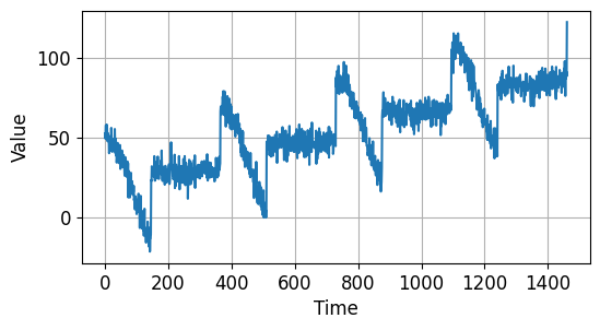
시계열 데이터 예측하기 - 시계열 데이터 만들기
예제2
split_time = 1000
time_train = time[:split_time]
x_train = series[:split_time]

time_valid = time[split_time:]
x_valid = series[split_time:]

plot_series(time_train, x_train)
plt.show()

plot_series(time_valid, x_valid)
plt.show()
시계열 데이터의 앞부분 1000개를 훈련용, 그리고 나머지를 검증용 데이터로 분리했습니다.
아래와 같이 두 부분으로 나눠졌습니다.
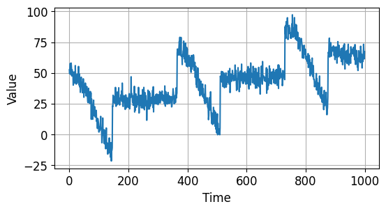
시계열 데이터 예측하기 - 시계열 데이터 만들기 (Train)

시계열 데이터 예측하기 - 시계열 데이터 만들기 (Validation)
Naive Forecast
예제1
naive_forecast = series[split_time - 1: -1]
plot_series(time_valid, x_valid)
plot_series(time_valid, naive_forecast)
naive_forecast는 말그대로 이전의 데이터를 다음 값으로 예측하는 시계열 데이터입니다.
우선 한 스텝 앞의 데이터를 가져와서 나타내면 아래와 같습니다.
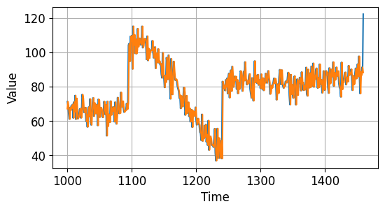
시계열 데이터 예측하기 - Naive Forecast
예제2
plot_series(time_valid, x_valid, start=0, end=150)
plot_series(time_valid, naive_forecast, start=1, end=151)
그래프 플롯의 시작 시점을 한 스텝 뒤로 했습니다.
앞에서 150개의 데이터를 나타내면 아래와 같습니다.
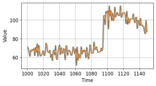
시계열 데이터 예측하기 - Naive Forecast
예제3
print(keras.metrics.mean_squared_error(x_valid, naive_forecast).numpy())
print(keras.metrics.mean_absolute_error(x_valid, naive_forecast).numpy())
61.827534
5.937908
keras.metrics 모듈의 mean_squared_error(), mean_absolute_error() 함수는 두 시계열 데이터 간의 오차를 정량화합니다.
각각 61.827534, 5.937908입니다.
지난 30개의 평균값으로 예측하기
예제1
def moving_average_forecast(series, window_size):
    forecast = []
    for time in range(len(series) - window_size):
        forecast.append(series[time: time + window_size].mean())
    return np.array(forecast)

moving_avg = moving_average_forecast(series, 30)[split_time - 30:]

plot_series(time_valid, x_valid)
plot_series(time_valid, moving_avg)
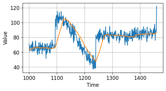
moving_average_forecast() 함수는 window_size 동안의 평균값을 다음 예측값으로 사용합니다.
아래 그림의 주황색 곡선으로 나타냈습니다.
시계열 데이터 예측하기 - 지난 30개의 평균값으로 예측하기
예제2
print(keras.metrics.mean_squared_error(x_valid, moving_avg).numpy())
print(keras.metrics.mean_absolute_error(x_valid, moving_avg).numpy())
106.674576
7.1424184
mean_squared_error(), mean_absolute_error() 함수로 예측의 오차를 확인해보면 각각 106.674576와 7.1424184입니다.