QCheckBox
The QCheckBox widget provides buttons with two states: on (checked)/off (unchecked). This widget provides a check box with a single text label. ( QCheckBox official document )
When a check box is selected or disabled, a stateChanged() signal occurs. You can connect this signal to a specific slot when you want to generate an action whenever the status of the check box changes.
You can also use the isChecked() method to check if a check box is selected. The boolean value is restored based on whether or not the box is selected.
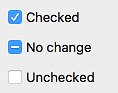
A typical check box only has a select/disable status, but a setTrustate() method allows it to have a ‘no change’ condition’. This check box is useful to give users options for choosing or not choosing.
Use the checkState() method to obtain the status of a check box with three states. It restores a value of 2/1/0 depending on whether it’s selected, unchaged or disabled.
The QButtonGroup class allows you to create groups of exclusive/non-exclusive button groups by tying multiple buttons. Exclusive button groups can only select one of several buttons. ( QButtonGroup official document )
The following table lists the methods that are frequently used with the QCheckBox widget.
Frequently used methods
Method |
Description |
|---|---|
text() |
Return the label text of the check box. |
setText() |
Set the label text for the check box. |
isChecked() |
Return the status of the check box. (True/False) |
checkState() |
Return the status of the check box. (2/1/0) |
toggle() |
Change the status of the check box. |
pressed() |
Create signals when the check box is pressed. |
released() |
Create signals when the check box is released. |
clicked() |
Create signals when the check box is clicked. |
stateChanged() |
Create signals when the state of the check box is changed. |
Example
import sys
from PyQt5.QtWidgets import QApplication, QWidget, QCheckBox
from PyQt5.QtCore import Qt
class MyApp(QWidget):
def __init__(self):
super().__init__()
self.initUI()
def initUI(self):
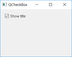
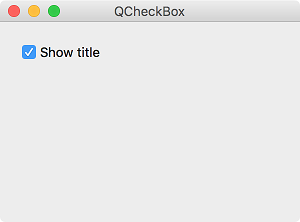
cb = QCheckBox('Show title', self)
cb.move(20, 20)
cb.toggle()
cb.stateChanged.connect(self.changeTitle)
self.setWindowTitle('QCheckBox')
self.setGeometry(300, 300, 300, 200)
self.show()
def changeTitle(self, state):
if state == Qt.Checked:
self.setWindowTitle('QCheckBox')
else:
self.setWindowTitle(' ')
if __name__ == '__main__':
app = QApplication(sys.argv)
ex = MyApp()
sys.exit(app.exec_())
We created a check box, and when it’s checked, the ‘QCheckBox’ text appears in the titlebar. The title appear and disappear according to the state of the checkbox.
Description
cb = QCheckBox('Show title', self)
Create a check box with a text label called ‘Show Title’.
cb.toggle()
Because the check box appears to be off by default, we used toggle() method to change it to on.
cb.stateChanged.connect(self.changeTitle)
Connect the signal that occurs when the state of the check box is changed (stateChanged) to the changeTitle() method.
def changeTitle(self, state):

    if state == Qt.Checked:
        self.setWindowTitle('QCheckBox')
    else:
        self.setWindowTitle(' ')
The state of the check box is given as a parameter in the changeTitle() method. If checked, the title will be represented as ‘QCheckBox’ and if not, as an empty string.